What you see when a legacy service is already running in the cluster
Screenshots of dashboards and diagrams we use in our enterprise notes. They are not mockups: they are the views a platform team looks at three in the morning when something restarts. Each image accompanies a specific entry about migration, resource limits, or message queues.
The screenshot shows a pod that restarts every few minutes due to a memory limit copied from the test environment. In the note we compare poorly calibrated requests and limits with values that sustain variable load, and we explain how to read kubelet events to distinguish out-of-memory from CPU throttling.
When two people apply changes on the same day to a local state, the plan stops being reliable. This view documents the moment before migrating to a remote backend: locks, orphaned resources, and the verification we do afterward to confirm that the plan is still the expected one.

Accumulating metrics and traces is easy; deciding which ones help diagnose an incident is another matter. The observability post's dashboard prioritizes a few series with operational value and leaves out the noise that only inflates the cost of long-term storage.
The diagram traces the journey of a message that fails three times before landing in the dead-letter queue. It helps explain why infinite retries hide design flaws and how to measure the age of pending items to detect buildup before it shows up in the consumer.
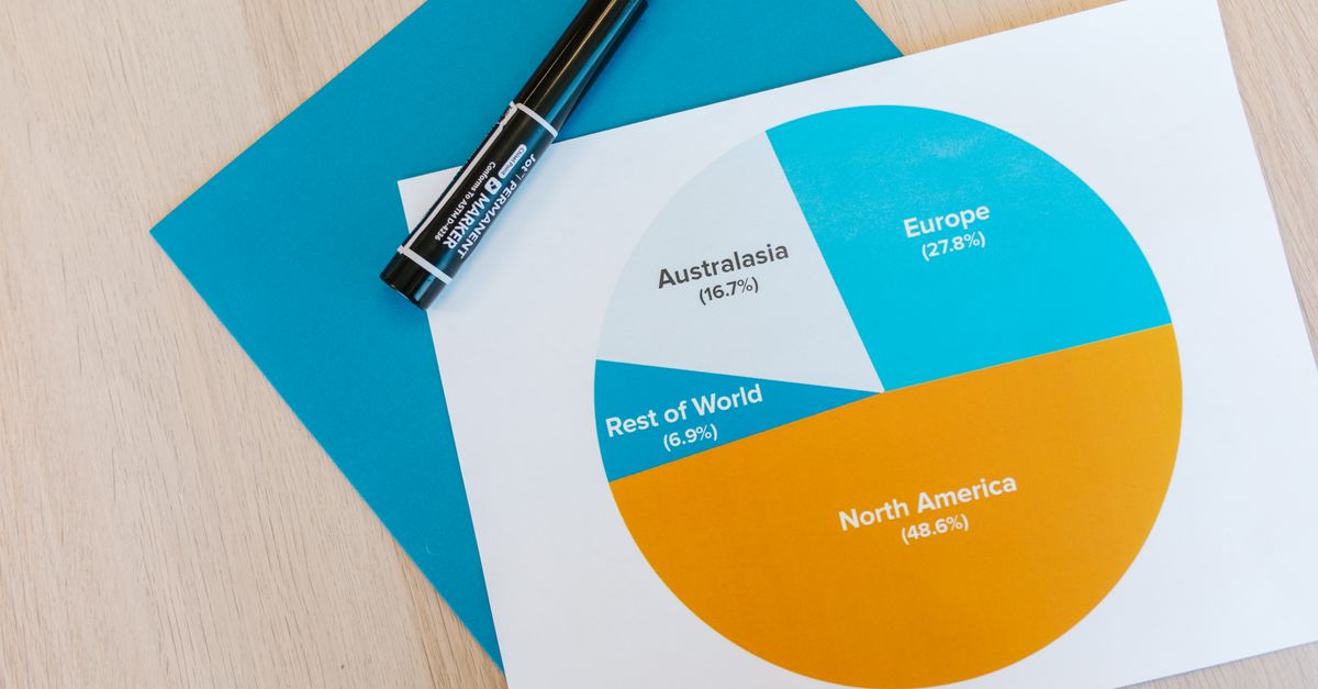
The bill rarely goes up because of a single resource. This view breaks down oversized instances, orphaned disks, and test environments nobody shuts down, and accompanies the note on review and tagging habits to attribute spending to each team without promising magic savings.

A legacy service that worked locally restarts in a cascade when containerized because it takes longer than the liveness probe accepts. The screenshot captures the startup logs and the readiness and liveness settings that separate environment configuration without rebuilding the image.